Marc Schoenbach: Horror Artist Showcase
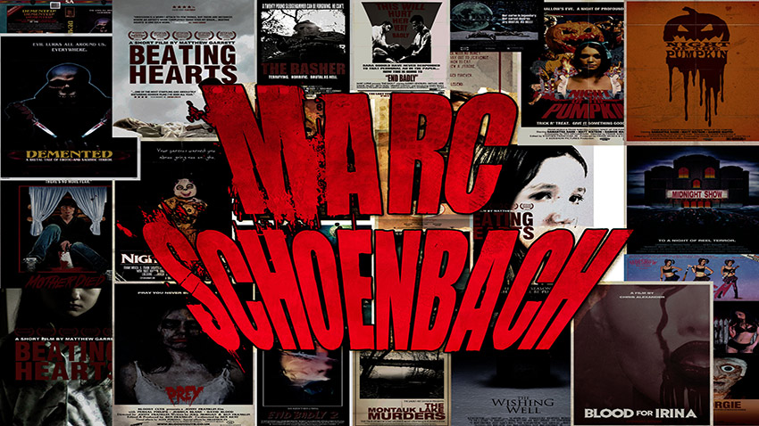
Meet horror artist Marc Schoenbach.
Psychologist by day, horror movie poster designer by night. At 30 years of age, I have finally found my calling in life. Designing posters for horror films! With no formal training in graphic arts, I have always had a fascination with graphics. I almost had an aneurysm when Sega CD came out back in the early 90s.
For me, designing for film media is a way to involve myself with many of my passions—design, film, and writing. It’s a funny thing, but at first, when I started designing these film posters, I was coming up with the entire concept—initially the idea, the story, and the badass title. It was a way for me to satiate all of my desires and it’s only been recently that I’ve been doing design for actual films.
Of course, my medium is designing retro posters, with a profound love of films from the late 70s and early/mid 80s. Like so many of people my age, I grew up on horror flicks, seeing Halloween II for the first time when I was 4! Designing posters from that great era always takes me back to those days when my mother would take me to the video rental store. I’d make a mad dash for the horror section and just gawk at all those titles and their awesome cover art. I’m fortunate that my mom was cool enough to rent me horror films at such a young age.
Reelybored: Being an avid horror fan and a psychologist by day, do you often see some sort of correlation between the horror portrayed on film and the horrors evident in the real world?
Marc Schoenbach: Well, certainly the horror portrayed on film reflects the kind of crazy nonsense that goes on out in the real world. Zombies, for example, are probably the most apparent example of this. I think if you really took an in-depth look at this new love obsession with these living dead apocalyptic films, you could certainly make the argument that this new love affair is, in part, in response to terrorism. Now, obviously, zombie films have been made for years, way before the attacks on September 11th. But I think in the wake of that awful day, there came this new incredible fear of biological warfare—this paranoid belief that the enemies possessed some sort of bioagent that would potentially wipe us all out and leave us in this unimaginable apocalypse. I don’t think filmmakers or even movie-goers are aware of this on a conscious level, but it’s on this subconscious level. Because horror movies are a way to sublimate the fear of everyday life, the most effective films will target what makes us all very afraid.
Reelybored: You mentioned that you initially were designing many of your posters with the idea, story, and even title in mind. Have you ever thought of making one of these films that was constructed in your head?
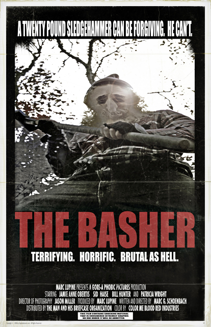
Marc: This is the dream. I’d like to think of myself as a writer first, and a graphic designer second. But the reality is, I do put more time into graphic design. I’d like to justify this by saying that my design is merely another outlet for me to get that idea in my head out into the open. Certainly, the esthetic image can be more effective at conveying thoughts. After all, there’s no reading involved! Let’s face it, nobody wants to read somebody’s unsolicited screenplay. Originally, I had grand ideas of turning some of my posters into actual movies. Currently, my hope is to just get involved more with the horror community. I don’t want to just be the guy in which horror filmmakers go to for some kick-ass one-sheets. No, I want to be a part of all that other magic! I’d love for a filmmaker to be so into my stuff that we have formed a bond somewhat. Then I figure I’ll ask them to read my screenplay and, being confident that my work is brilliant, perhaps get it made! I’d like to have seen one of my earlier works, The Basher, get made. I am not proud of the design on this one… hell, it was designed over seven years ago! This “film” followed some new kiss-ass journalist dying for her break. She and her film team venture into the woods of some country bumpkin town where these brutal murders have been taking place. Then, you know, horrific things start happening.
Reelybored: I also have fond memories of going into a video rental store with my dad and running towards the horror section to see what new “cheese” was available that given week. I too saw Halloween II at a very young age, even before seeing the original Halloween, and can remember the profound impact that film left on me. Do you attribute watching horror at such a young age as a cause for your fondness of the genre and your interest in making horror movie posters?
Marc: One-hundred percent! A large part of who I am is centered around my childhood. Some fucks might say I never grew up, or people like me have never matured. But, truthfully, if they really think that, they can suck my ass. I think it’s so important to embrace those magical moments of when you were a kid and didn’t have to worry about the kinds of things that can really bog people down nowadays. For me, it was horror, always has been. I remember summer nights after dinner, taking a walk to the local video store. I remember the smell. Mmm, damn that clean smell of VHS tapes mixed with the scent of air conditioning. I always found myself heading straight for the horror section. Man, was that always a rush! All those boxes lined up, their artwork a morbid and delightful calling card. Back then I didn’t like to read the synopsis of movies, so I relied instead heavily on the box art. But all of these experiences, so positive as they were, have burned lovely etchings in my brain. It’s why I’ll always love horror. It’s just a pleasant reminder that, yes, no matter how stressful life gets, there’s always that escape. When I design today, I’ll usually have a soundtrack playing, especially work by John Carpenter.
Reelybored: What would you say is your proudest work of art and why?
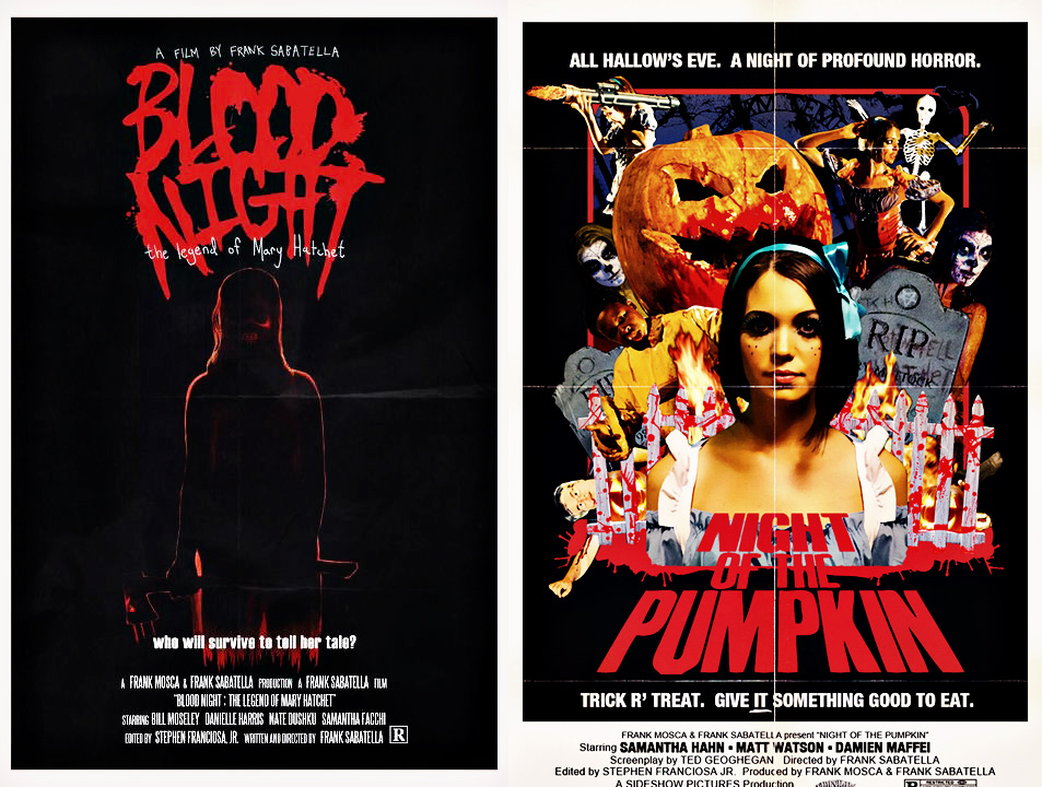
Marc: Probably Night of the Pumpkin. That’s this incredible little short from the very talented Frank Sabatella, director of “Blood Night: The Legend of Mary Hatchet”. I remember I had met Frank at the DVD release party of Blood Night. He seemed like a super nice guy. With Facebook, we were able to keep in contact. One day, while taking a shit, I sat holding the DVD for his film. I wasn’t thrilled with the cover art and felt that it didn’t really reflect the awesomeness of the film. I literally jumped off the bowl and designed my version. I had sent it to him and he was super impressed. Nothing more came of it. But then I had heard he was directing this short flick, Night of the Pumpkin. I contacted him, asking if I could do the poster art. He seemed cool with the idea and gave me access to all his pictures from the film on his Facebook. The pics were pretty low res, but I made it work. I put so much time into that particular poster, I think I listened to the Cannibal Holocaust theme no less than fifty times, and the Trioxin theme, perhaps forty. I finished the poster at about 4 am, right around the time his crew was releasing NOTP. Frank responded to my email, giving me the biggest praise. Later that day, my poster was all over Facebook with so many people going gaga over it. Hell, I even had two job offers by the end of the day. I’ve always questioned my ability as an artist. But on that day, I got all the validation I needed. It was the best feeling.
Reelybored: Any particular cover art from the VHS era or posters from your childhood that have inspired you the most?
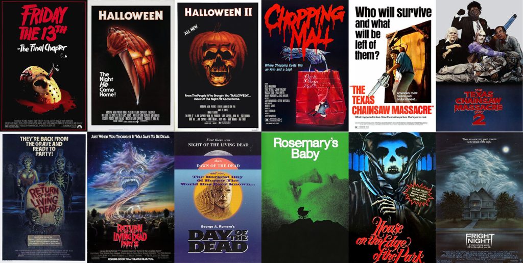
Marc: I love them all. But I am especially in love with Friday the 13th: Part IV, the one where that buck knife is going through the eye of the hockey mask. It’s just so fucking creepy. I love the original Halloween I and II posters. I masturbate regularly to the Chopping Mall poster. I think I’m a big fan of simplicity. An iconic image over black. I dig that. Other posters that make me go from 6 o’clock to 12 o’clock are The Texas Chain Saw Massacre I and II, Return of the Living Dead I and II, Day of the Dead, Rosemary’s Baby, The House at the Edge of the Park, Fright Night, and The Ghoulies. There’s about a hundred and twenty more.
Reelybored: Do you think the value and detail of horror poster art is the same today or would you say it has dwindled from the magnificent poster art we once saw during the grindhouse, slasher, exploitation, etc. eras?
Marc: I’ve seen some pretty great modern horror posters in recent times. I really dig My Bloody Valentine 3D poster, along with The Human Centipede one-sheet, and dare I say it, some of the Saw posters. But, yes, generally as a whole, modern poster art does not hold a candle to the stuff from the 60s, 70s, and 80s. I am not saying that merely to be some sort of movie poster era snob, but rather I’m saying that because most modern-day movie posters are so uncreative it’s appalling. There was this fantastic post that the immensely talented Tom Hodge from The Dude Designs had posted on his Facebook. Apparently, he came across this stock image of this tormented girl crawling. He then showed how that same exact girl was on the cover of like five different box arts. Something like that is just inexcusable and I don’t really know why any filmmaker would want to go that route. I do understand that most of the time it’s the larger studios or distribution companies responsible for such trite, but that’s the whole point. Horror poster art today, as well as any other kind of genre poster art, is more about appealing to a certain market and selling the product, rather than wowing their audiences with artwork that makes people actually want to see the film. The irony, of course, is that awesome movie poster art is an amazing and highly effective way of generating interest for a film. And it’s something that’s lost with this modern concept of mass-produced, “Photoshopped”, stock-nonsense advertising.
Reelybored: What would you say makes an iconic poster?
Marc: A simple yet effective image that evokes both curiosity, fear, and insight into what the film is about. A great iconic poster becomes even more memorable when the film that its advertising is effective. Then that poster gains a reputation as the symbol and essence of the film. Think about the original poster for Halloween. It’s this mysterious man’s hand swiping down a butcher’s knife against a pumpkin. After seeing that film, we know it’s the bogeyman’s hand, and suddenly that poster becomes more haunting, more creepy, and even more effective. It’s so iconic, in fact, that people have gone to tattoo that image on their bodies!
Reelybored: If you could pick one movie from the past, which horror film would you love to have a go at designing its poster art?
Marc: Well, if I was ever asked to do some DVD box art like some of my fellow inspirations do, then I’d have to say, any of the Halloweens or Friday the 13th films. But hell, I’d be honored to do any artwork for any vintage horror. Ideally, I’d love more than anything to do a modern-stylized movie poster for the next Halloween in 3D. It would also be an honor to do the official poster art for any of Rob Zombie’s future projects. Those familiar with the posters for Halloween I and II (Zombie’s version) know that those posters were, well, not that interesting.

Reelybored: How would you describe designing a movie poster? Its inception to the final product?
Marc: When I work with the filmmakers, I’d really like to have almost complete creative control. I know a lot of artists are this way. For obvious reasons, it makes the process so much more organic and natural. Basically, if possible, I’d like to have read the script. When reading the script, I keep in mind any scenes that could be considered “iconic”, something to really help sell the concept of the film. I like to get a sense of the film both thematically, as well as visually. If the film takes place mostly at night, I’d like the poster to convey that. I generally ask the filmmakers for any photos that I may use as a reference. Then I start looking at them, figuring out what would make a good composition. I generally look at about a hundred actual movie posters to both get inspired, as well as to maybe use as a very, very loose reference. I then choose a soundtrack or put on a movie that will put me in the appropriate mood and I do like to drink beer as I find a slight buzz frees me up a bit. If I’m not boozing it up, I fancy a very cold 7Up or even ice water. Once the poster is essentially done, I can begin to relax. My favorite part of the process is color correction and aging. This is when the poster comes alive. It’s at this part where I start fantasizing about holding it in my hands, smelling the paper, imagining what the poor thing went through and how long it hung in the local video store’s window, basking in the sun, fading it, giving it personality.
Reelybored: What would you say is the most difficult aspect when designing a poster?
Marc: I have no formal training in design. Everything I know, I have taught myself. When I envision what I’d like my posters to look like, there are sometimes aspects of design that I do not know. I am not accepting of the idea of altering my vision based on the fact that I may not know how to technically execute my design. At this point, it’s sort of frustrating, as I now have to learn the methods necessary to carry out my design. I have even gone as far as contacting my favorite artists, such as Tom Hodge and Justin Osbourn of Slasher Design. I have, for past designs, bothered these guys, asking them questions like, “Uh, how do I…?” They have been most helpful in their responses and give me the inspiration to continue with the task at hand.
Reelybored: Tell us a little about your work that was featured on the cover of Fangoria magazine?
Marc: I was lucky enough to have been contacted by Chris Alexander, Editor-in-Chief of Fangoria magazine. He loved my work and asked me if I’d like to have my designs featured in a special VHS issue Fango was planning on putting out. After picking myself up off the floor, I wrote him back. “Hell Yes!” I was interested. There was a bit of a delay in the whole process, as the VHS special wasn’t going to come out yet. But Alexander did want to work with me. He asked if I’d like to, in the meantime, do a teaser poster for his upcoming film, Blood For Irina. He loved my work and soon asked me if I’d be interested in doing the cover for issue #314. That issue features the beautiful and amazingly talented, Debbie Rochon, lit with bluish and pink lights, surrounded with a halo of dry-ice smoke, ala 1987! Credit must be given to the highly skilled Claire Oddy, whose original photograph of Rochon was used in making the cover. Hopefully, for Halloween month (fingers crossed) I will be asked to make my triumphant return for Fango where my design company, Sadist Art Designs will have a three-page spread.

Reelybored: What’s next for you?
Marc: Designing and Writing. Writing and Designing. I’ll keep at this for as long as it takes.
Reelybored: Where do you hope to be in the next few years?
Marc: I’d like Sadist Art Designs to be a known and reputable poster and media design company. I’d like for my screenplays to get read by the right people, and the best of people to make them!
Reelybored: Any parting words for other artists out there who one day hope to become movie poster designers?
Marc: Don’t worry about not having a degree in design. Just focus on your craft. Be hard on yourself, but not too hard where it becomes counterproductive. Try to hone your craft every day by creating things just for the fun of it. When you’ve got yourself a bit of a portfolio, use social networking to contact independent filmmakers. Don’t be a cocksucker and demand a thousand bucks. Hard work will pay off, eventually. Work. Work. Work. Don’t answer your phone, ever. Drink heavily at times. Reward a twelve-hour design session with a good masturbation session.
